Data can be visualized by representing it as plots easy to understand, explore, and grasp. To analyze a set of data using Python, we make use of Matplotlib, a widely implemented 2D plotting library. Seaborn is basically a visualization library that sits on top of Matplotlib and all it does is make it a little prettier to look at.
Seaborn is an open-source that provides high-level API for visualizing the data using Python programming language. It also has a bunch of unique kinds of charts and graphs that we didn’t have in Matplotlib.
Import Aspects of Seaborn
- Functions for visualizing univariate and bivariate distributions.
- A function to plot statistical time series data with flexible estimation and representation of uncertainty around the estimate.
- Functions that visualize matrices of data and use clustering algorithms to discover structure in those matrices.
- High-level abstractions for structuring grids of plots that let you easily build complex visualizations.
- Tools for choosing color palettes to make beautiful plots that reveal patterns in your data.
- Several built-in themes for styling Matplotlib graphics
Install Seaborn
To install the latest release of Seaborn, you can use pip:
pip install seaborn
It’s also possible to install the released version using conda:
conda install seaborn
Alternatively, you can use pip to install the development version directly from GitHub:
pip install git+https://github.com/mwaskom/seaborn.git
Another option would be to clone the GitHub repository and install from your local copy:
pip install
Importing Seaborn
Let us import the Matplotlib library, which helps us customize our plots.
# Matplotlib for additional customization
from matplotlib import pyplot as plt
We will import the Seaborn library with the following command −
import seaborn as sb
Manipulating Figure Aesthetics
Matplotlib is highly customizable, but they can complicate it at the same time as it is hard to know what settings to tweak to achieve a good-looking plot.
Let’s see it working:
#matplotlib inline
import numpy as np
import matplotlib as mpl
import matplotlib.pyplot as plt
import seaborn as sns
np.random.seed(sum(map(ord, "aesthetics")))
#Define a simple plot function, to plot offset sine waves
def sinplot(flip=1):
    x = np.linspace(0, 14, 100)
    for i in range(1, 7):
        plt.plot(x, np.sin(x + i * .5) * (7 - i) * flip)
sinplot()
This is what the plot looks like with Matplotlib defaults:

If you want to switch to Seaborn defaults, call it ‘set’ function:
sns.set()
sinplot()
Output:

Seaborn figure styles
Seaborn provides five preset themes:
- White Grid
- Dark Grid
- White
- Dark
- Ticks
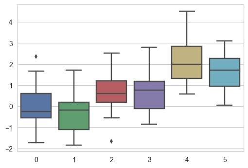
Dark Grid is the default one. The White Grid theme is similar but better suited to plots with heavy data elements, to switch to White Grid:
sns.set_style("whitegrid")
data = np.random.normal(size=(20, 6)) + np.arange(6) / 2
sns.boxplot(data=data)
Output:
Removing Grid
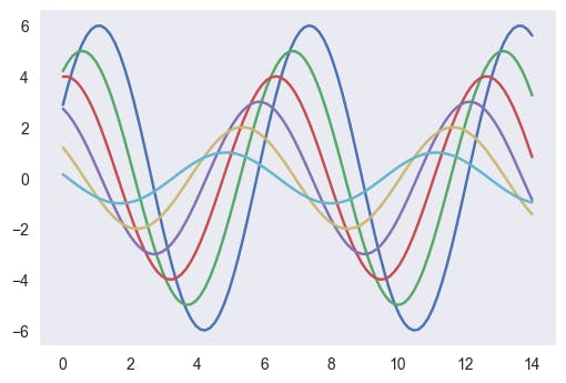
For many plots, the grid is less necessary. Remove it by adding this code snippet:
sns.set_style("dark")
sinplot()
Output:
Or try the white background:
sns.set_style("white")
sinplot()
Output:

Structuring Plots
Sometimes give a little extra structure to the plots, which is where ticks come in handy:
sns.set_style("ticks")
sinplot()
Output:

Removing Axes Spines
You can call despine function to remove them:
sinplot()
sns.despine()
Output:

When the ticks don’t cover the whole range of the axis, the trim parameter will limit the range of the surviving spines:
f, ax = plt.subplots()
sns.violinplot(data=data)
sns.despine(offset=10, trim=True)
Output:

You can also control it removes which spines with additional arguments to despine:
sns.set_style("whitegrid")
sns.boxplot(data=data, palette="deep")
sns.despine(left=True)
Output:

Temporarily Setting Figure Style
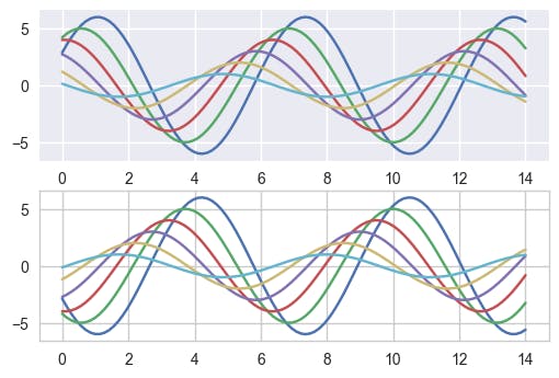
axes_style() comes to help when you need to set figure style, temporarily:
with sns.axes_style("darkgrid"):
   plt.subplot(211)
   sinplot()
plt.subplot(212)
sinplot(-1)
Output:
Overriding Elements of Styles
A dictionary of parameters can be passed to the rc argument of axes_style() and set_style() in order to customize figures.
Note: I can override Only the parameters that are part of the style definition through this method. For others, use *set()* as it takes all the parameters.
You can then set unique versions of these parameters:
sns.set_style("darkgrid", {"axes.facecolor": ".9"})
sinplot()
Output:

Scaling plot elements
Let’s try to manipulate the scale of the plot. We can reset the default parameters by calling set():
sns.set()
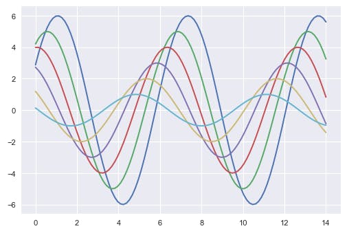
The four preset contexts are — paper, notebook, talk, and poster. The notebook style is the default and was used in the plots above:
sns.set_context("paper")
sinplot()
Output:
sns.set_context("talk")
sinplot()
Output:

Starting with Plotting
Visualizing data is one step and further making the visualized data more pleasing is another step.
Visualization is an art of representing data in an effective and easiest way. Aesthetics means a set of principles concerned with beauty, especially in art.
Let’s start by loading up a real dataset on 2019 model-year vehicles and plotting a histogram just using Matplotlib to see the distribution by several gears.
%matplotlib inline
import pandas as pd
#Dataset import
df = pd.read_csv(“http://media.sundog-soft.com/SelfDriving/FuelEfficiency.csv")
gear_counts = df[‘# Gears’].value_counts()
gear_counts.plot(kind=’bar’)
Output:

Figure 1: Using Matplotlib
We can load up Seaborn, and just call set() on it to change Matplotlib’s default settings to something more visually pleasing.
import seaborn as sns
sns.set()
Now if we do the same plot command, it’s a little more modern looking. We base Matplotlib on Matplot, and its visualization defaults are frankly showing their age.
gear_counts.plot(kind\='bar')
Output:

Figure 2: Using Seaborn
Further, we are gonna see types of plotting which should give you a fair idea on how to implement when needed:
1. Displot
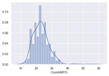
Seaborn includes many types of plots that Matplotlib doesn't offer. For example, “distplot” can plot a histogram together with a smooth distribution of that histogram overlaid on it. Let’s plot the distribution of MPG values on the vehicles in this database as an example:
sns.distplot(df[‘CombMPG’])
Output:
2. Pair Plot
Something you encounter often is a “pair plot” from Seaborn. This lets you visualize plots of every combination of various attributes together, so you can look for interesting patterns between features.
As an example, let’s classify cars by how many cylinders are in their engines, and look for relationships between cylinders, city MPG rating, Highway MPG rating, and combined MPG rating.
df2 = df[['Cylinders', 'CityMPG', 'HwyMPG', 'CombMPG']]
sns.pairplot(df2, height=2.5);
#Seaborn currently has a bug with the hue parameter so we've omitted it
Output:
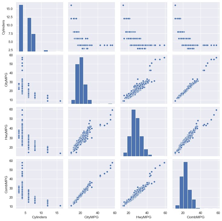
By studying the results above, you can see there is a relationship between the number of cylinders and MPG, but MPG for 4-cylinder vehicles ranges really widely and appears to be a good linear relationship.
3. Scatter Plot
Seaborn 1.9 also includes “scatterplot”, which is exactly what it sounds like. It plots individual data points across two axes of your choosing, so you can see how your data is distributed across those dimensions.
sns.scatterplot(x=”Eng Displ”, y=”CombMPG”, data=df)
Output:

4. JointPlot
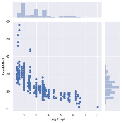
Seaborn also offers a “jointplot”, which combines a scatterplot with histograms on both axes. This lets you visualize both the individual data points and the distribution across both dimensions at the same time.
sns.jointplot(x=”Eng Displ”, y=”CombMPG”, data=df)
Output:
5. Implot
The “lmplot” is a scatterplot, but with a linear regression line computed and overlaid onto the data.
sns.lmplot(x=”Eng Displ”, y=”CombMPG”, data=df)
Output:

6. Boxplot
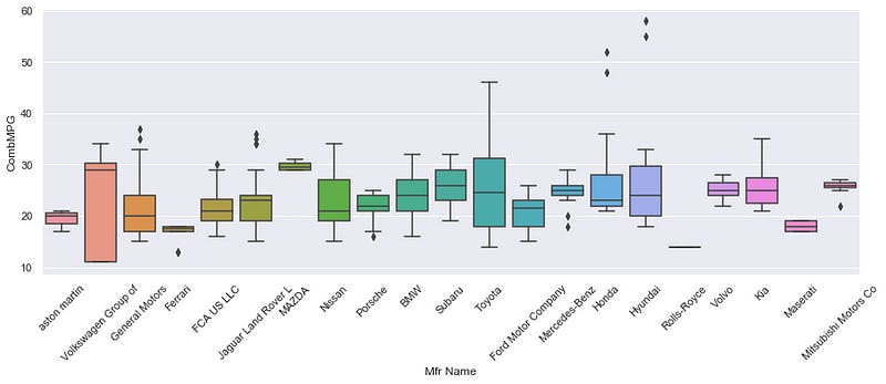
Next, let’s look at a “box plot.”, which is useful for visualizing typical values for a category without getting distracted by outliers.
Each box represents the range between the first and third quartiles of the data, with a line representing the median value. The “whiskers” that extend from the box represent the spread of the rest of the data, apart from clear outliers that are plotted as individual points outside of the whiskers.
As an example, let’s look at box plots for each vehicle manufacturer, visualizing the miles-per-gallon ratings across the vehicles they produce. This lets us look at the spread of MPG ratings across all the vehicles each manufacturer offers.
sns.set(rc={'figure.figsize':(15,5)})
ax=sns.boxplot(x='Mfr Name', y='CombMPG', data=df)
ax.set_xticklabels(ax.get_xticklabels(),rotation=45)
There are a lot of manufacturers, so to make the resulting graph readable we’ll increase Seaborn’s default figure size, and also use set_xticklabels to rotate the labels 45 degrees.
Output:
7. SwarmPlot
Another way to visualize the same data is the “swarm plot.” Instead of boxes and whiskers, it plots each individual data point — but does so in such a way that groups them together based on their distribution.
ax=sns.swarmplot(x='Mfr Name', y='CombMPG', data=df)
ax.set_xticklabels(ax.get_xticklabels(),rotation=45)
Output:

8. CountPlot
Another tool is the “count plot.” This is basically the same thing as a histogram, but for categorical data. It lets you count up how many times each given category on the X axis occurs in your data, and plot it. So for example, we can see that General Motors offers more vehicle models than anyone else, with BMW not far behind.
ax=sns.countplot(x='Mfr Name', data=df)
ax.set_xticklabels(ax.get_xticklabels(),rotation=45)
Output:

9. Heat Map
Let’s look at a heat-map in Seaborn. A heat map allows you to plot tabular, 2D data of some sort, with colors representing the individual values in each cell of the 2D table.
In this example, we’ll create a pivot table from our original data frame, to create a 2D table that contains the average MPG ratings for every combination of several cylinders and engine displacement.
The resulting heat map shows all the engine displacement values along the X-axis and all the cylinder values along the Y-axis.
For each cell of the table, we represent the actual average MPG rating for that combination of cylinders and engine displacement not as a number, but as a color that ranges from the dark for small values, and light for larger values.
df2 = df.pivot_table(index='Cylinders', columns='Eng Displ', values='CombMPG', aggfunc='mean')
sns.heatmap(df2)
And, this allows you to visualize a clear trend where things get progressively darker as we move from the top-left of the graph to the bottom-right. Which makes sense; we associate higher MPG ratings with lower numbers of cylinders and lower engine displacement values.
By the time we get to an 8-liter 16-cylinder engine, the average MPG is at its worst of about 12, represented by the color black.
This graph has a lot of missing data, but the heat map deals with that gracefully. A 3-cylinder 8-liter engine does not exist!
Output:

Conclusion
In this lesson, we have seen that Seaborn makes it easy to manipulate original graph plots. We have seen examples of scaling and changing context.
Seaborn makes it easy to visualize data attractively and make it easier to read and understand. Hopefully, this guide will help you visualize your own data with much control and visualize graphs in a beautiful way.
